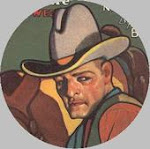
For a change of pace, let’s take a look at a comic book with one of my favorite Atlas Comics artists handling the cover: Joe Maneely. Maneely could create a sense of depth and texture with a few scratchy squibbles, and his dynamic poses set up dramatic scenes on nearly all the covers by him I’ve seen.
Maneely, a workhorse for Stan Lee in the 1950s, doesn’t provide any interior art for this issue. At least, he’s not credited in its pages, nor is he credited at the Grand Comics Database Project (GCD) page for this issue. So the main focus of this posting is on the credited artist for the four Wyatt Earp stories in this issue: Norman Maurer.
I wasn’t familiar with Maurer when I first saw this issue. There are elements in the inking that suggested to me that Maneely handled at least some of the inks: scratchy textures; the use of blacks for shadows, folds in clothing, and silhouetted figures in the background; and outlines with no shading or details in some backgrounds. But Maurer is credited with all the inks at the GCD, and it may be that he modeled some of his inking effects on stylistic touches used by Maneely, who was clearly a Stan Lee favorite during this period.
Maurer had an interesting career outside of comics: he was Moe Howard’s son-in-law (you know Moe Howard -- the black-headed “leader” of the Three Stooges with the bowl haircut) and helped bring the Stooges to comics and animated TV shows; helped develop 3-D comics with Joe Kubert; worked with Kubert on the first “learn how to draw comics” mail-order course (which likely influenced Kubert when he launched his comic artists’ school years later); wrote and directed movies for The Stooges; and worked at Hanna-Barbera on Scooby Doo and other properties. Oh, and he drew comics, such as Mighty Mouse, and westerns for Atlas.
In these Wyatt Earp stories, Maurer has a style that recalls some of Jack Davis’ work in westerns for EC at the time, in that the characters have realistic statures and positions, but there are slightly cartoonish exaggerations in their expressions or physical characteristics. It’s the sort of blending of realism and cartoonish exaggeration you see in Will Eisner’s work on The Spirit.
The stories are entertaining and successful mostly because of Maurer’s art. The plots are formulaic, B-western clichés, but the art is charming and engaging. For example, the splash page for the lead story, “The Man Who Came Back from Boot Hill,” is nicely dynamic in its establishing shots, introducing the menace of the tale, and the dramatic entrance of the title hero. Page 2 of this tale, the scan of which leads off this post, provides a good example of how Maurer ably controls the storytelling, even though he’s constrained by breaking his page into seven panels with a lot of text in word balloons. Note the silhouetted stagecoach in the background of panel 1, the relatively simple background in panel 3, the character captured in the faces of panel 4 (this panel makes me wonder if Jean Giraud (aka Mobius) looked at Maurer’s art when he was working on his French Blueberry western comics), the cinematic birds-eye view in panel 6, and the dynamic action depicted in panel 7. Great stuff! I'll be keeping my eye open for more western work by Maurer.


3 comments:
I've got a couple of these comics in my collection. Interesting piece.
Fascinating post, looking forward to more about artists.
Glad you liked it. I mentioned Jack Davis in connection with EC comics, but perhaps more folks know him today for his work on MAD magazine, TV Guide, Hollywood movie posters, and various advertisements in the 1960s and '70s. Panel 6 of page 2 in particularly strikes me as a Davis-influenced layout.
Post a Comment